
- How To Tackle Jealousy In Creative Writing
- Common Submission Mistakes
- How To Stop Your Blog Becoming Boring
- The One Thing Every Successful Writer Has In Common
- How To Make Yourself Aware Of Publishing Scams
- Why Almost ALL Writers Make These Grammar Mistakes At Some Point
- 5 Tips For Authors On How To Deal With Rejection
- Top Mistakes to Avoid When Writing a Novel
- How to Avoid Common New Writer Mistakes
- 10 Mistakes New Fiction Writers Make
Tips For A Great Book Layout
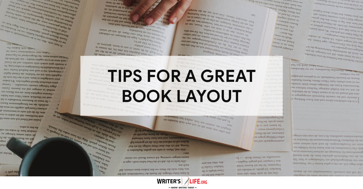
If you are getting to the final pre-publishing stages for your book and want to know what the best layout might be before you let the world see it, use these tips to ensure your book looks as good as it reads.
Let the content do the talking
A strong book layout needs to consider the content of your book. This means that there is room for every type of book to have a unique layout that perfectly reflects what’s inside. A decent designer knows that there isn’t a one size fits all approach. Each new book is a blank canvas where the content can guide the process. Content-led design just makes good sense. This is true regardless of whether you have created an image-heavy cookbook, a beautifully illustrated children’s story, or a fast-paced text-only novel. Remaining conscious and aware of the subject matter while also considering the genre, the typical design elements in books similar to yours will ensure that you get this right.
Pay attention to text alignment
Lining up your text is one of those should-be simple’ tasks that can actually cause a lot of grief. Your lines must have consistent vertical spacing and should be justified too. Using an automatic word processor function to do this is not recommended. It could space lines out too much and stretch them out to keep them the same length. Instead, use specialized book software to help you.
A consistent grid is also necessary for book layout perfection. So ensure the text lines up horizontally from page to page. It’s always worth ordering a test copy if you are printing on demand. This will make sure that the grid is still perfectly aligned before you do a mass order.
Check your margins
You need to make sure the line length of your bargains is standardized throughout your manuscript. This is to make sure that the text doesn’t disappear when the book is bound. For ebooks the gutter margin can be thinner, but for most standard books, there should be 0.5-inch margins around the top and bottom. There should also be 0.75-0.9-inch gutter margins to be safe that all the text remains visible on the page.
Pay attention to the details
Little details can make all the difference when it comes to creating a streamlined reading experience. You should be striving to ensure that your layout helps to enhance readability, and everything from the font type to letter spacing of small caps to ornamental breaks in between scenes can make a huge difference.
Keep white space even
We all know that lots of white space can help create a clutter free reading experience and ensure that the readers don’t feel overwhelmed by the text. However, it is important the white space is even throughout the page and that you don’t go overboard. Massive margins will squash your text, where a generous amount of space for chapter headings (about 1//3 of a page) looks good if you are using chapter headings for your book.
These tips are just some of the things that book designers must consider. If you are self-publishing your book or just want to get it into as good a shape as possible before sending it to agents and publishers, follow these tips to create a clean, functional, and attractive layout.
So now you've learned everything you need to know about book layout, why not try some tips on how to give your story structure?
Get A Free Writer's Toolkit By Visiting https://www.writerslife.org/gid

Related Posts

Stay Connected


-
 Writing Tips for Adding Internal Conflict to Action Scenes
Internal Conflict in Action is like the secret ingredient...
- July 23, 2025
-
 How to Get More Writing Done in Less Time
Writing efficiency is something all writers strive for, but...
- July 23, 2025
-
 10 Writing Myths That Waste Your Time and Energy
Writing myths have a way of sneaking into our...
- July 23, 2025
-
Writing Tips for Adding Internal Conflict to Action Scenes
Internal Conflict in Action is like the secret ingredient...
- July 23, 2025
-
 Writing Prompt Basics: Tips for New Writers
"Share, Like or Tweet If You Love Writing" Even...
- January 31, 2015
-
 How to Avoid Common New Writer Mistakes
"Share, Like or Tweet If You Love Writing" So...
- January 31, 2015
-
 10 Mistakes New Fiction Writers Make
"Share, Like or Tweet If You Love Writing" For...
- January 31, 2015
-
 25 Things to Know About Self-Publishing Your Book
"Share, Like or Tweet If You Love Writing" A...
- January 31, 2015
-
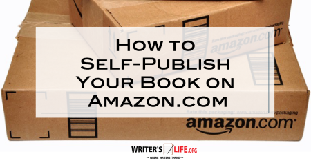 How To Self-Publish Your Book On Amazon
Not so long ago, the first hurdle for an...
- January 31, 2015
-
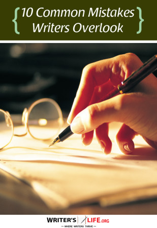 10 Common Mistakes Writers Overlook
"Share, Like or Tweet If You Love Writing" Like...
- January 30, 2015
-
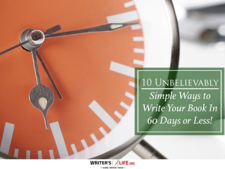 10 Unbelievably Simple Ways to Write Your Book In 60 Days or Less! (What most publishing houses don’t want you to know)
"Share, Like or Tweet If You Love Writing" Whether...
- January 30, 2015
-
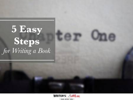 5 Easy Steps for Writing a Book
"Share, Like or Tweet If You Love Writing" Writing...
- January 27, 2015
-
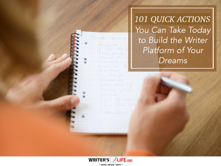 101 Quick Actions You Can Take Today to Build the Writer Platform of Your Dreams
"Share, Like or Tweet If You Love Writing" 101...
- January 19, 2015