
- How To Tackle Jealousy In Creative Writing
- Common Submission Mistakes
- How To Stop Your Blog Becoming Boring
- The One Thing Every Successful Writer Has In Common
- How To Make Yourself Aware Of Publishing Scams
- Why Almost ALL Writers Make These Grammar Mistakes At Some Point
- 5 Tips For Authors On How To Deal With Rejection
- Top Mistakes to Avoid When Writing a Novel
- How to Avoid Common New Writer Mistakes
- 10 Mistakes New Fiction Writers Make
How to Format Your Book for Large Print Readers

Understanding the unique requirements of a Large Print Book Format can significantly enhance readability and accessibility for your audience. By tailoring your book's format, you're not just widening the reach of your stories, but also fostering inclusivity. With the demand for large print books on the rise, let's explore how you can effectively format your book for large print readers.
Why Large Print Formatting Guide Matters in the Book World
Large print books are more than just larger fonts; they're a gateway to reading for those with visual impairments or other reading challenges. By using a Large Print Formatting Guide, you ensure that your book remains reader-friendly. How often have we overlooked the simplicity of a clear and accessible design, opting instead for flashy, complex layouts that might alienate some readers?
Adopting a proper format helps you fulfill the primary mission of any writer: reaching as many readers as possible. It's not just about accessibility, it's about enhancing the reading experience. A well-formatted book can make a difference, allowing your story to shine without making your readers strain their eyes.
According to Wikipedia, large print books are typically printed in a font size that ranges from 16- to 18-point. This difference might seem trivial but can significantly affect reading comfort and engagement.
Crafting the Ideal Book Layout for Large Print
Ensuring the right book layout for large print requires thoughtful planning. It's about balancing the text size with other elements like line spacing and margins. When creating a Book Layout for Large Print, consider increasing the line spacing to 1.5 or even double spacing. This not only makes the text more legible but prevents crowding on the page.
The choice of typeface is equally crucial. Serif fonts such as Georgia or Times New Roman are generally clearer for the visually impaired compared to sans-serif fonts. Combining these fonts with proper spacing creates a cleaner and easier-to-navigate page.
Remember that the overall design for large print books should accommodate more than just the main text. Consider including high-contrast headings and larger images where relevant. It's about creating an all-around accessible reading experience.
Best Practices for Large Print Formatting
Creating a large print edition of your book involves adhering to a set of best practices. The guidelines here will help you format while keeping your readers' needs in mind.
- Font Size: Opt for at least a 16-point type to ensure clear visibility.
- Line Spacing: Use a generous line spacing to make the text distinguishable and easy on the eyes.
- Margins: Wide margins not only improve aesthetics but also enhance readability.
- Text Alignment: Justify left to avoid uneven spacing that can confuse readers.
- Contrast: Use high contrast between text and background for better visibility.
These best practices for large print formatting are not merely technical tips; they're ways to express empathy and understanding through design.
Essential Large Print Text Layout Considerations
Designing a readable large print text layout goes beyond choosing the right font size. Consistency is crucial. Maintaining a consistent heading size and style helps guide your readers through the book, making navigation easier.
Don't forget the importance of color and contrast in your Large Print Text Layout. A stark contrast between text and background ensures every word is crisp and clear. When using images, ensure captions are legible and enhance the comprehension of your content. This thoughtfulness in design speaks volume about your dedication to reader experience.
Preparing Your Manuscript: Large Print Format Requirements
The process of preparing your manuscript incorporates specific Large Print Format Requirements that shouldn't be overlooked. Begin by setting your document to the required size. Depending on your needs, formats like 8.5 x 11 inches or 7 x 10 inches are generally preferable for large print books.
Next, consider the technical details that accommodate readability. Ensure consistent paragraph styles and avoid starting or ending a page mid-sentence wherever possible.
Preparing your manuscript with the right large print format requirements not only makes it accessible but also professional. Lastly, test-read your manuscript or have someone with visual challenges provide feedback to ensure it meets accessibility standards.
Want to promote your book after it's published? Check out our Book Marketing Articles.
Frequently Asked Questions About Large Print Book Format
Q: What font size should I use for large print books?
A: Aim for at least a 16-point font size to ensure readability and comfort for visually impaired readers.
Q: Are there specific paper dimensions recommended for large print books?
A: Yes, typical dimensions include 8.5 x 11 inches or 7 x 10 inches, which accommodate the larger font size and maintain readability.
Q: Can I use color in large print books?
A: While you can use color, it's essential to maintain a high contrast between text and background for better legibility.
If you're serious about growing your author career, don't miss out on these free tools and templates built specifically for writers. Access all 7 free resources here.
Related Posts

Stay Connected


-
 Writing Tips for Adding Internal Conflict to Action Scenes
Internal Conflict in Action is like the secret ingredient...
- July 23, 2025
-
 How to Get More Writing Done in Less Time
Writing efficiency is something all writers strive for, but...
- July 23, 2025
-
 10 Writing Myths That Waste Your Time and Energy
Writing myths have a way of sneaking into our...
- July 23, 2025
-
Writing Tips for Adding Internal Conflict to Action Scenes
Internal Conflict in Action is like the secret ingredient...
- July 23, 2025
-
 Writing Prompt Basics: Tips for New Writers
"Share, Like or Tweet If You Love Writing" Even...
- January 31, 2015
-
 How to Avoid Common New Writer Mistakes
"Share, Like or Tweet If You Love Writing" So...
- January 31, 2015
-
 10 Mistakes New Fiction Writers Make
"Share, Like or Tweet If You Love Writing" For...
- January 31, 2015
-
 25 Things to Know About Self-Publishing Your Book
"Share, Like or Tweet If You Love Writing" A...
- January 31, 2015
-
 How To Self-Publish Your Book On Amazon
Not so long ago, the first hurdle for an...
- January 31, 2015
-
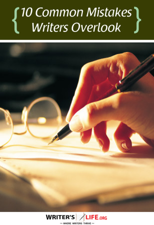 10 Common Mistakes Writers Overlook
"Share, Like or Tweet If You Love Writing" Like...
- January 30, 2015
-
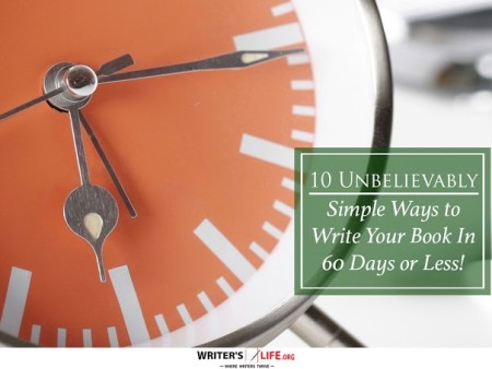 10 Unbelievably Simple Ways to Write Your Book In 60 Days or Less! (What most publishing houses don’t want you to know)
"Share, Like or Tweet If You Love Writing" Whether...
- January 30, 2015
-
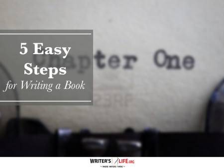 5 Easy Steps for Writing a Book
"Share, Like or Tweet If You Love Writing" Writing...
- January 27, 2015
-
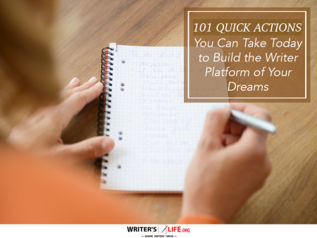 101 Quick Actions You Can Take Today to Build the Writer Platform of Your Dreams
"Share, Like or Tweet If You Love Writing" 101...
- January 19, 2015