
- How To Tackle Jealousy In Creative Writing
- Common Submission Mistakes
- How To Stop Your Blog Becoming Boring
- The One Thing Every Successful Writer Has In Common
- How To Make Yourself Aware Of Publishing Scams
- Why Almost ALL Writers Make These Grammar Mistakes At Some Point
- 5 Tips For Authors On How To Deal With Rejection
- Top Mistakes to Avoid When Writing a Novel
- How to Avoid Common New Writer Mistakes
- 10 Mistakes New Fiction Writers Make
10 Cover Mistakes That Make Your Book Look Unprofessional
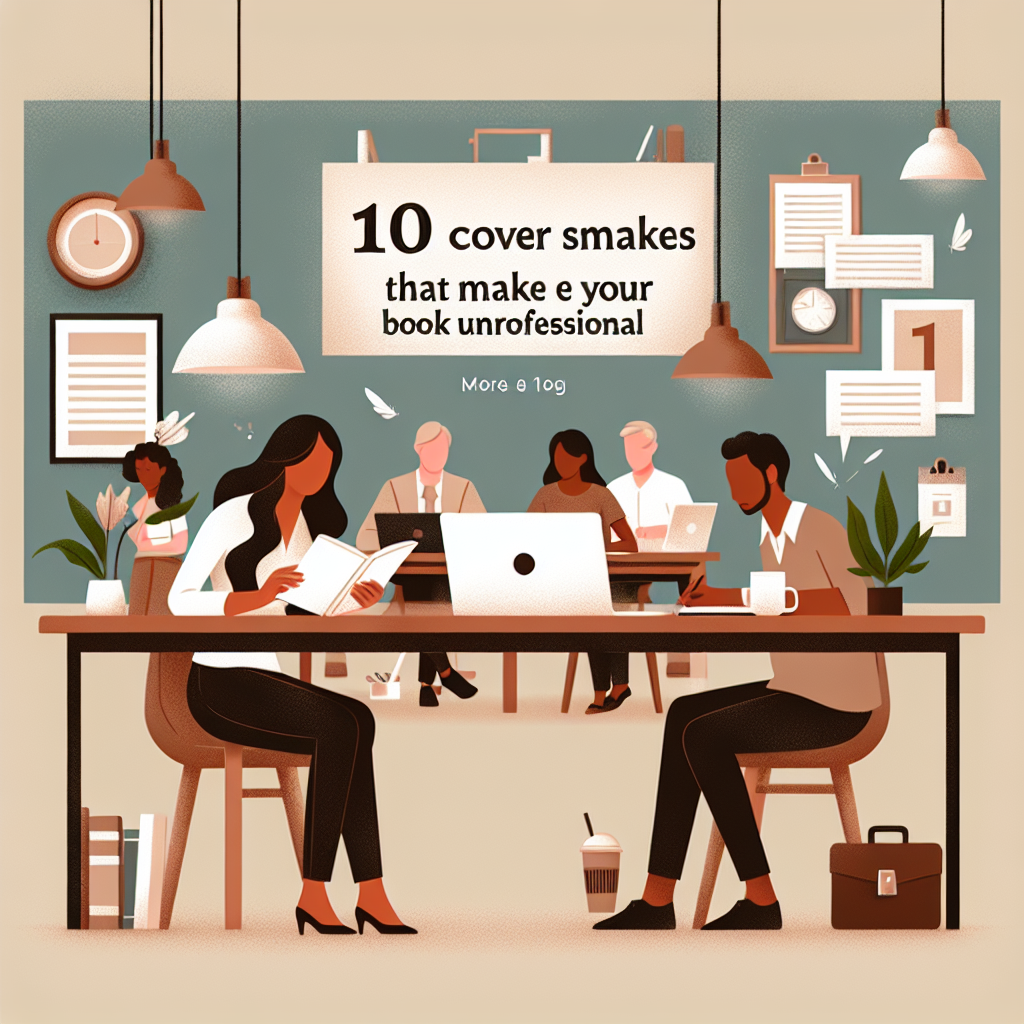
Book cover mistakes can significantly impact how potential readers perceive your work. Even the best-written story can be overlooked if the cover doesn't convey professionalism. Let's explore some common book cover errors that could be hindering your book's success and how to avoid them.
How Dangerous Book Cover Errors Deter Readers
One of the most dangerous book cover errors is neglecting the importance of your cover's first impression. Have you ever judged a book by its cover? Most of us have, whether consciously or subconsciously. A cover that's too busy or lacks deep meaning can cause potential readers to glance over your masterpiece in favor of a more visually appealing one.
Incorporating too many elements can lead to unprofessional book cover problems. Think about walking into a cluttered room; it's overwhelming, right? The same goes for a complicated cover design. A streamlined, focused concept usually resonates better.
Combining mismatched fonts is another common book cover design pitfall. Imagine wearing a tuxedo with flip-flops – that's the sartorial equivalent of sprinkling comic fonts in a romantic novel cover. Consistency in typography not only looks cleaner but also conveys the right tone for your narrative.
Prevent Book Cover Failures with Thoughtful Image Choices
Image choice is paramount in avoiding book cover challenges. Opting for overly-used stock photos can lead to brutal book cover setbacks. These images may be low-cost, but they're often generic and lack the unique flavor your book deserves. Opt for custom illustrations or unique imagery that aligns with your book's themes.
Poor resolution images are costly book cover issues that scream amateur. No one wants to squint at a pixelated picture; it can imply a lack of attention to detail. Use high-quality imagery to ensure your cover looks as sharp and vibrant in print as it does on-screen.
Color choices can also present risks in book cover designs. Colors that clash or create visual discomfort can steer readers away. Choosing a complementary palette is essential, as it guides readers' emotions and sets the right mood for your book.
Avoid Common Book Cover Errors in Text Placement
Text placement on a cover can make or break its professionalism. Padding your title and author's name too close to the edges can cause unprofessional book cover problems, especially during printing. Ensure there's enough breathing room for every element.
An overly complex subtitle or tagline can also create issues. Readers want clarity, not a brainteaser. If your subtitle takes longer than a few seconds to comprehend, you might want to simplify it.
Contrasting colors between text and background is critical. Struggles with readability are dangerous book cover errors that can instantly derail interest. If readers can't easily discern the title from afar, they might move on to clearer options.
Combat Costly Book Cover Issues with a Strong Design Process
The strategy you employ in creating your cover can prevent book cover failures. Jumping into design without preliminary research can be a costly oversight. Understand your genre norms, what currently sells, and how your unique spin can stand out.
Relying solely on trends is another book cover design pitfall. While it might seem smart to follow what's popular, trends change. Aim for timeless design elements that offer the longevity your story deserves.
Testing your cover with a focus group isn't just for big publishers. Gather feedback from friends, fellow authors, and potential readers. Their input can help you spot unintentional errors or miscommunications in the design.
Professional cover design isn't merely about aesthetics; it's a pivotal marketing tool. As budding authors, treating it with the same respect as your manuscript is crucial.
Want to promote your book after it’s published? Check out our Book Marketing Articles.
Frequently Asked Questions About Book Cover Mistakes
Q: How important is font choice on a book cover?
A: Font choice is crucial. It sets the tone and makes the text readable. Consistency and relevance to your book's theme are essential.
Q: Can I use any colors I like for my book cover?
A: While personal preference matters, aim for colors that evoke the right emotional response and ensure text remains readable.
Q: How do stock images affect my book cover's professionalism?
A: Overused stock images can make your cover seem generic. Unique visuals often enhance the perceived value and originality of your book.
If you're serious about growing your author career, don't miss out on these free tools and templates built specifically for writers. Access all 7 free resources here.
Related Posts

Stay Connected


-
 Writing Tips for Adding Internal Conflict to Action Scenes
Internal Conflict in Action is like the secret ingredient...
- July 23, 2025
-
 How to Get More Writing Done in Less Time
Writing efficiency is something all writers strive for, but...
- July 23, 2025
-
 10 Writing Myths That Waste Your Time and Energy
Writing myths have a way of sneaking into our...
- July 23, 2025
-
Writing Tips for Adding Internal Conflict to Action Scenes
Internal Conflict in Action is like the secret ingredient...
- July 23, 2025
-
 Writing Prompt Basics: Tips for New Writers
"Share, Like or Tweet If You Love Writing" Even...
- January 31, 2015
-
 How to Avoid Common New Writer Mistakes
"Share, Like or Tweet If You Love Writing" So...
- January 31, 2015
-
 10 Mistakes New Fiction Writers Make
"Share, Like or Tweet If You Love Writing" For...
- January 31, 2015
-
 25 Things to Know About Self-Publishing Your Book
"Share, Like or Tweet If You Love Writing" A...
- January 31, 2015
-
 How To Self-Publish Your Book On Amazon
Not so long ago, the first hurdle for an...
- January 31, 2015
-
 10 Common Mistakes Writers Overlook
"Share, Like or Tweet If You Love Writing" Like...
- January 30, 2015
-
 10 Unbelievably Simple Ways to Write Your Book In 60 Days or Less! (What most publishing houses don’t want you to know)
"Share, Like or Tweet If You Love Writing" Whether...
- January 30, 2015
-
 5 Easy Steps for Writing a Book
"Share, Like or Tweet If You Love Writing" Writing...
- January 27, 2015
-
 101 Quick Actions You Can Take Today to Build the Writer Platform of Your Dreams
"Share, Like or Tweet If You Love Writing" 101...
- January 19, 2015